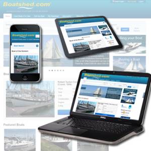
Boatshed goes responsive
Boatshed goes Responsive!
Today, nearly 30% of Boatshed's traffic is mobile. By the end of next year, this may exceed 50% Tablet sales are expected to exceed 100 million this year. Smartphones, of course, are also a hot commodity, with the majority of people now owning a smartphone.
The shift to mobile is happening at an extraordinary speed. For those of us who create the Boatshed websites and services, all this leads to a singular conclusion: A million screens have bloomed, and we need to build websites that work better on all of them.
Last month, for example , Boatshed was accessed on 507 different devices.
What about building Apps or a Mobile site you say? This is one strategy but according to the Pew Research Centre, 60% of tablet users prefer reading content on the traditional web, rather than via an app or Mobile website.
At Boatshed we feel that while other companies do offer apps, it's clear that having a great mobile website should be the priority.
The solution, of course, is to make a Boatshed website that works equally well on every device.
Enter the Boatshed responsive web design.
In simple terms, a responsive website figures out what resolution of device you are using and the flexible images and grids re-size correctly to fit the screen.
The benefits are obvious: Boatshed now works seamlessly across thousands of different screens.
With the launch of Boatshed Version 28.5 we have also improved these features for Boatshed users;
Login with your Facebook or Google accounts
My Boatshed
BoatFinder
Blogs & Articles
We need your help
As usual we would really welcome your feedback and suggestions on how we can make things better, just click the feedback tab on the right of the screen.
Thanks again :)
Boatshed Crew x
Reference Material: Responsive web design

